Charts and Graphics
Data visualizations tell a story, so information hierarchy and design is vital. Make sure viewers find key points quickly and naturally. Reinforce data with declarative text and simple color combinations.
Visualizing data hierarchy
- Place dominant data in primary reading position (top left).
- Place remaining data starting from 12 o’clock and moving clockwise.
- Show a maximum of five segments, adding a table when needed.
Using color
- Pair the dominant color with the most important data.
- Secondary colors may be used to aid visual separation, but allow the primary color to dominate.
- Color helps differentiate, but so does shape. When using symbols to organize information, employ both for clarity and accessible content.
Charts and Graphics
Types of charts
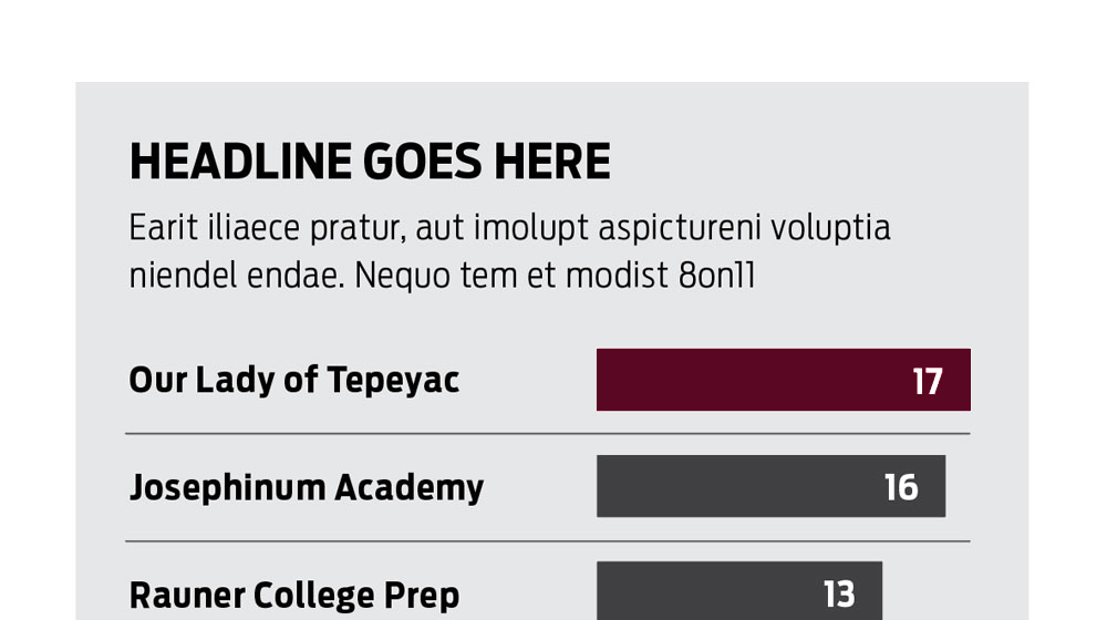
Charts
Bar
Compares the quantity of items.
- Text can be bold or light, depending on the number of items being compared.
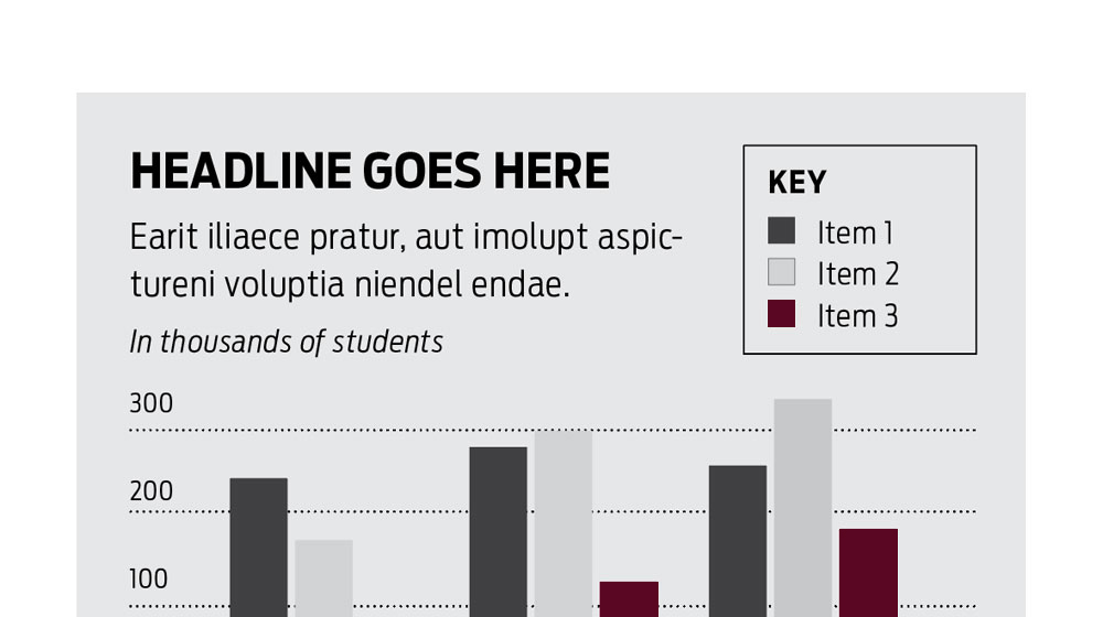
Charts
Column
Compares a category over equal periods of time.
- Label the x-axis with increments from zero to whatever the range is needed. The range one chooses can sometimes skew the story so be judicious and note the presentation.
- Use color to emphasize the key point—in this case, that’s the growth of the third item.
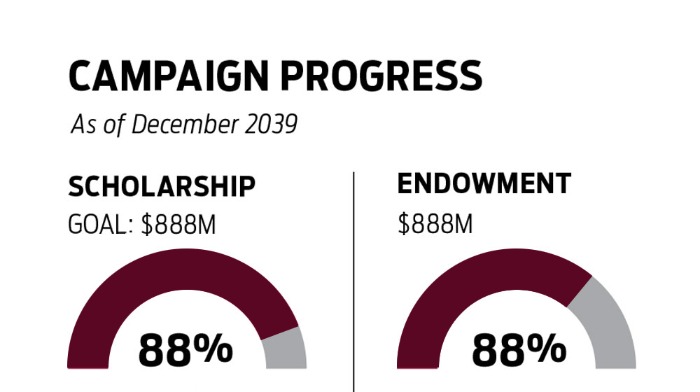
Charts
Donut
Compares components that make a whole. It can also show one component that is part of the whole. For example, progress toward a goal.
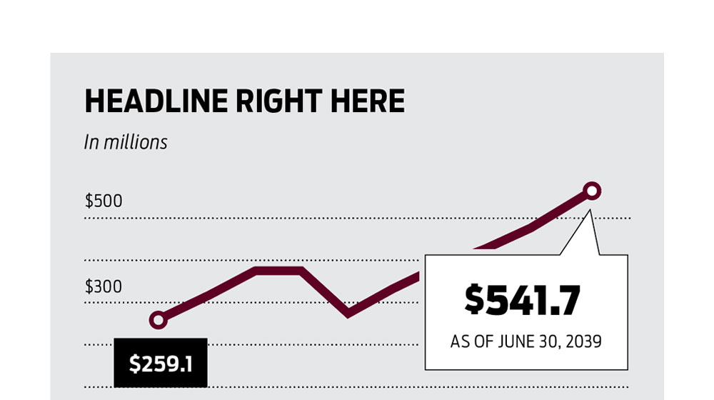
Charts
Line
Illustrates change over time (trend).
- It’s essential to show starting and ending values for context.
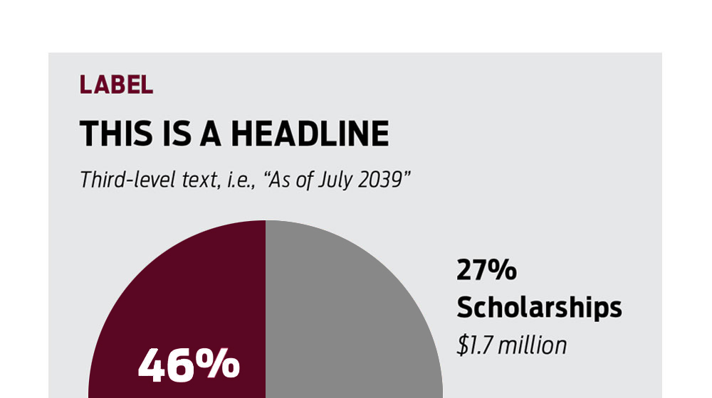
Charts
Pie
Compares individual items often by quantity or mass.
- Other than labels and numbers, supporting text is generally unnecessary.
- Data flows clockwise from 12 o’clock, starting with the largest segment.
Visualizing data hierarchy
- Place dominant data in primary reading position (top left).
- Place remaining data starting from 12 o’clock and moving clockwise.
- Show a maximum of five segments, adding a table when needed.
Using color
- Pair the dominant color with the most important data.
- Secondary colors may be used to aid visual separation, but allow the primary color to dominate.
- Color helps differentiate, but so does shape. When using symbols to organize information, employ both for clarity and accessible content.
